
Here’s a quick test: open your dispensary analytics dashboard right now and find out what your revenue by location was yesterday. How long did that take? Did you need to run a report, export a file, or ask someone else to pull the numbers?
If the answer to any of those is yes, your dispensary dashboard isn’t doing its job. A dispensary POS system collects an enormous amount of cannabis retail data every shift; the point of the dashboard is to make that data accessible fast, without a detour through spreadsheets or a manual report request. Every minute spent digging for an answer is a minute not spent on your floor, your team, or your next purchasing decision.
Here’s the reality: Any reasonable question a manager needs answered during a shift should be available in under 30 seconds without leaving the screen.
To give you the full picture, we’ve organized the 25 questions below into five outcome areas: revenue, inventory, staff performance, product trends, and compliance. Use them as a self-assessment; if your current setup can’t answer most of them quickly, you have a reporting gap that is costing you efficiency and visibility. Additionally, we’ve mapped each question to a specific Cova feature that answers it – so if you’re already a Cova client, you can use this as a checklist to make sure you’re using your dispensary data dashboards to their full potential.
One distinction before diving in: Hub Reports are tabular data exports built for detailed analysis, scheduled delivery, and record-keeping. Dashboards are visual, interactive tools with drill-downs, real-time overlays, and metric tracking. Both serve a purpose – but for 30-second answers during operating hours, the dashboard is where you live.
Key Takeaways
- A cannabis POS dashboard should answer most operational questions in under 30 seconds without requiring an export.
- Dashboards are for real-time visual exploration; Hub Reports are for detailed tabular data and scheduled delivery. Both serve a purpose, but only dashboards answer questions during a shift.
- Cova POS's Advanced Reporting includes 10+ dashboards, Pulse alerts for proactive monitoring, mobile access via the Sisense app, and automated email subscriptions for Hub Reports.
Boost Dispensary Revenue: What Does Your Business Look Like Right Now?
Q1: What is my revenue so far today?
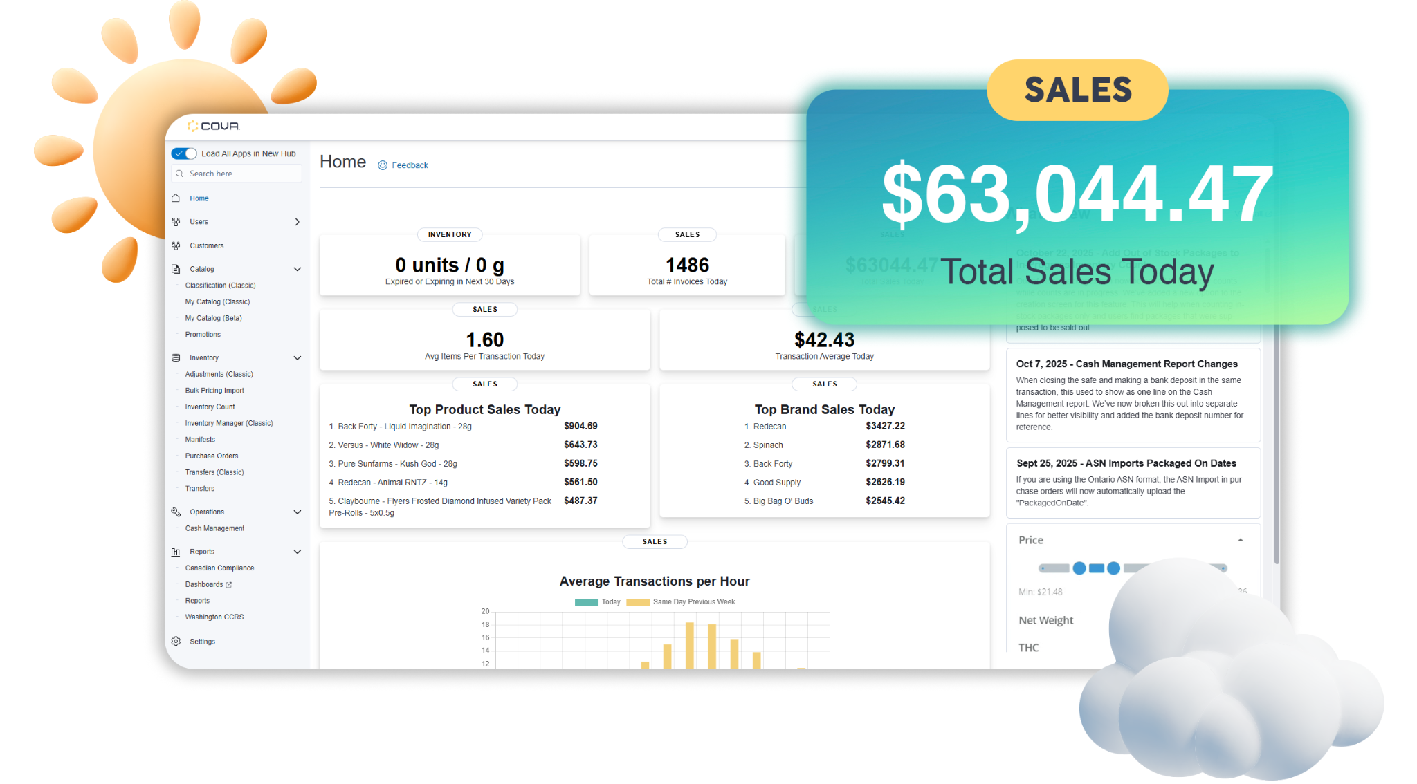
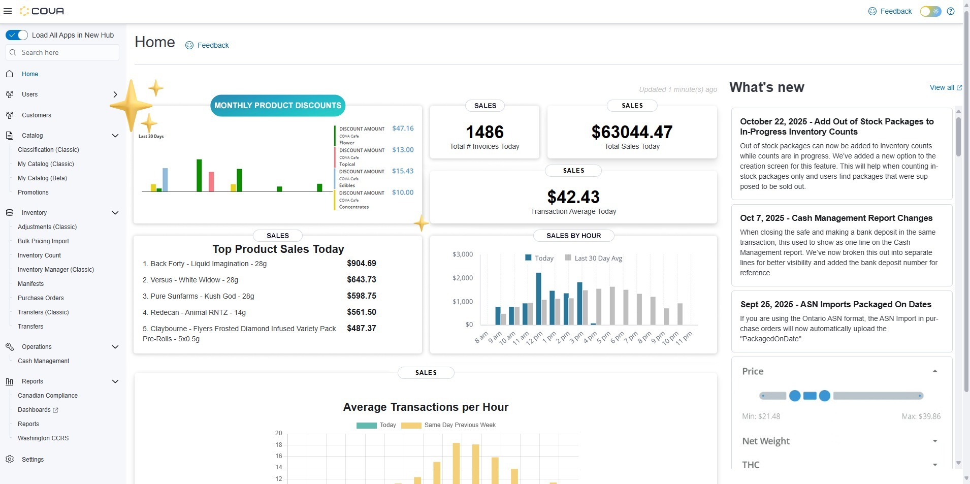
The Daily Dashboard shows today's sales total alongside the 30-day daily average, giving you an instant benchmark rather than a raw number with no context. Home Page Widgets also preview key metrics directly from the Hub home page, so you can check without navigating anywhere.
This matters because a number without context is just noise. Knowing whether today’s revenue is running above or below your typical pace tells you whether to pivot or stay the course.
Q2: Am I on track to hit my daily target?
The Daily Dashboard includes a configurable sales forecast built on historical data. You can set the forecast window, choose how far back the history period goes (30, 60, or 90 days), opt to ignore anomalous periods, and see upper and lower confidence bounds. Pulse adds a proactive layer: set a threshold on your daily revenue metric and get an automatic alert via email, mobile, or Slack if you start falling short.
The difference between a forecast and a target alert is significant: a forecast shows where you’re headed, while Pulse tells you when to intervene.
Q3: How does this week compare to last week?
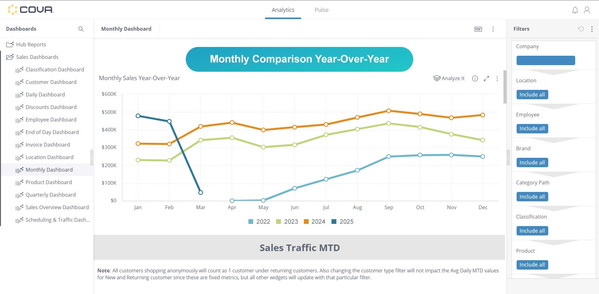
The Sales Overview Dashboard provides week-to-date, month-to-date, and year-to-date comparisons in one view. The Analyze button on any chart lets you overlay a previous period trend line for direct comparison. You can toggle between logarithmic and linear trend views and choose to ignore anomalies for a cleaner read.
Week-over-week comparison is the heartbeat of retail performance management; it catches the impact of a promotion, flags a gradual decline, and shows you whether a good or bad day is part of a pattern.
Q4: Which location is outperforming right now?
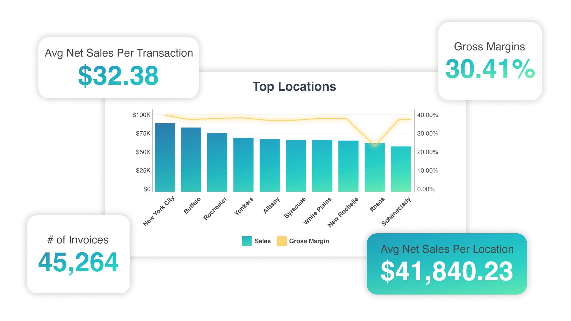
The Sales Overview Dashboard lets you right-click any data point and drill down by location. The Monthly Dashboard highlights which stores are up or down versus last month and shows exact change amounts. The Location Dashboard shows gross margin for the company overall and per location – so you can compare profitability, not just top-line sales.
This is especially crucial for multi-location operators (or those looking to scale to multiple locations). A store that is outperforming today is doing something worth replicating; a store falling behind needs attention now, not at the end of the month.
Q5: When are my peak sales hours today?
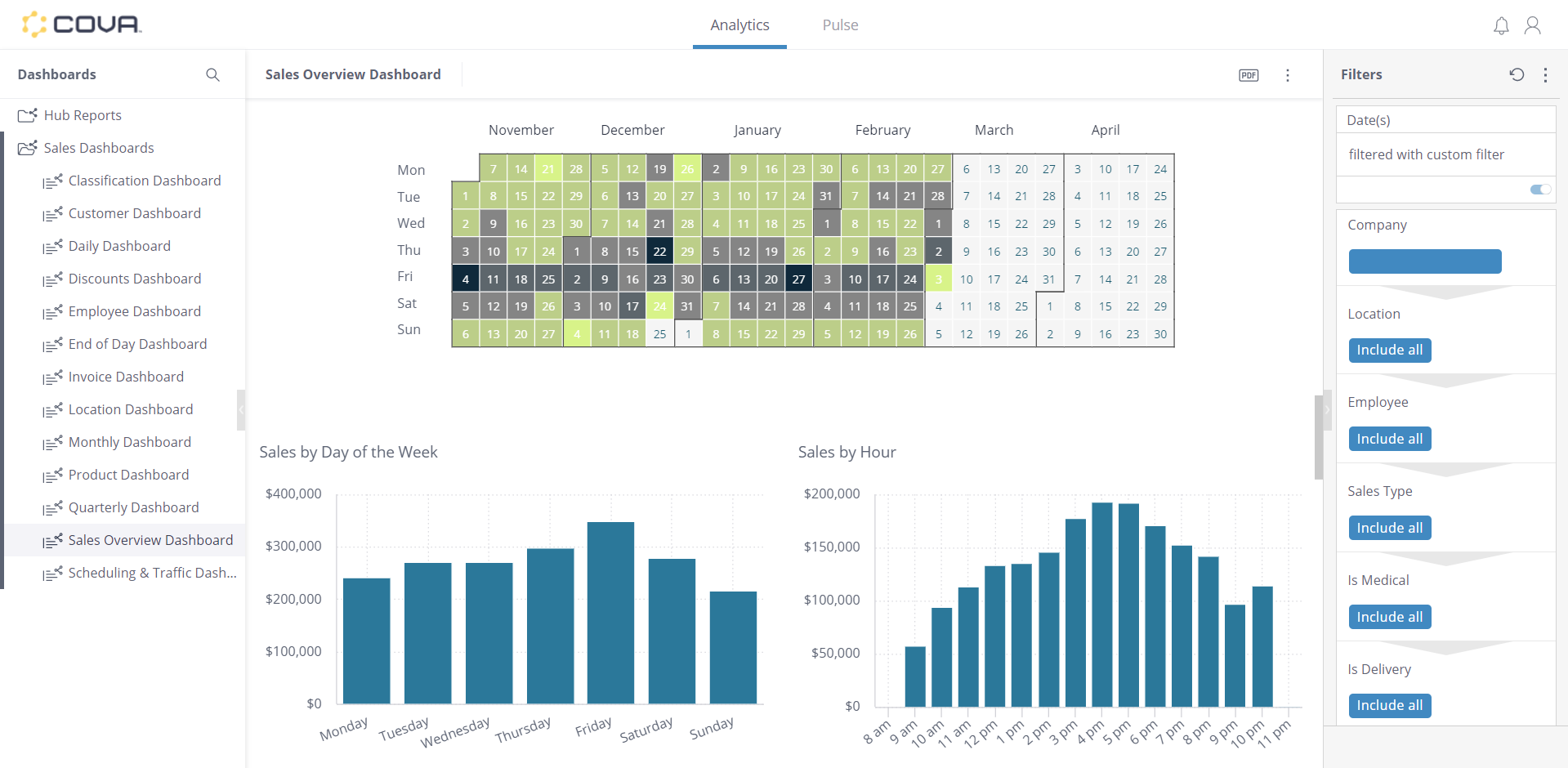
The Scheduling and Traffic Dashboard breaks down sales by hour and day of week over the last 30 days, highlights above-average periods automatically, and shows both dollar amounts and invoice counts. It is also filterable by product, so you can see when specific categories sell most for time-based promotions. The Daily Dashboard adds a real-time hourly overlay in red against the historical average.
Matching staffing to actual traffic patterns is one of the fastest ways to cut labor costs without degrading service. The product-level filter adds another dimension: timing your promotions to when demand for that category naturally peaks.
Track and Manage Dispensary Inventory More Efficiently
Q6: Am I about to run out of any top sellers?
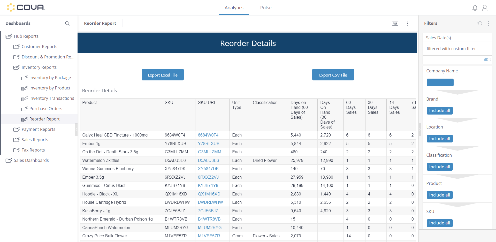
The Reorder Report shows days of stock remaining across 7, 14, 30, and 60-day columns, expected stock levels, a minimum stock column, and a Days Out of Stock column that reveals how often a product has been unavailable. Pulse can alert you when any stock metric crosses a threshold you define.
A stockout on a top seller doesn’t just lose that sale – it sends the customer to a competitor. The Days Out of Stock column tells you how often that’s already happened.
Q7: Which products have not sold in 30+ days?
The Inventory On Hand by Product report includes a Days Since Last Sold column visible at the location level, not just company-wide. The Products to Archive report specifically flags items to clear out, identifying products you should either promote, transfer, or remove from active inventory before they expire or take up space indefinitely.
Dead stock ties up cash and shelf space. Catching it early gives you options: run a promotion, move inventory to a location where it sells, or archive before expiration.
Q8: What is my total inventory value right now?
Inventory On Hand by Product shows in-stock cost, retail value in stock, profit margin in both dollar and percentage terms, and an On Hold Quantity field for inventory reserved for other purposes. All values are filterable by location.
Cash flow planning in cannabis retail requires knowing exactly how much capital is sitting on the shelves. The margin columns let you see not just cost but expected return, so you can identify products tying up disproportionate cash relative to what they will generate.
Q9: Are any packages expiring this week?
The Product Expirations report shows days until expiration, expiration state (expired versus expiring soon), use-by date, and expiration date for every package. It is designed specifically to help you identify products for promotions before the window closes.
Selling expired product is a compliance violation, but destroying product you could have discounted is a margin loss you didn’t have to take. This report gives you the opportunity to act on nearly expired inventory while it’s still sellable.
Q10: Do I have count discrepancies to resolve?
The Inventory Count Details report includes a Difference column showing stock-at-count versus actual count, plus a Cost Difference column for the dollar impact. The Inventory Count Name hyperlinks directly to the originating count, so you can trace every discrepancy to its source without leaving the report.
Count discrepancies are the first indicator of shrinkage, process errors, or compliance gaps. The dollar-impact column lets you prioritize; for instance, a two-unit gap on a high-value product matters more than a ten-unit gap on a low-cost item.
Reduce Cannabis Retail Staff Costs and Reward Top Performers
Q11: Who is my top-performing budtender this shift?
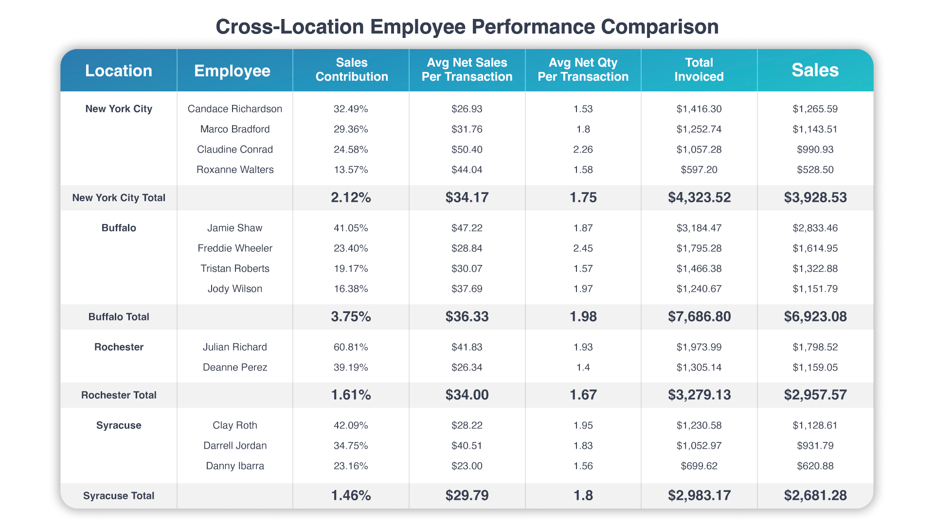
The Sales by Employee report ranks staff by invoices sold, transaction average, gross sales, gross profit, gross margin percentage, and tips, all of which are filterable by location. The Daily Dashboard also breaks performance down by employee. The report distinguishes between the employee who created an order and the one who tendered it, which matters in stores where roles are split.
Gross Margin % is the column to watch. A budtender selling high volume at low margin may be less valuable than one selling fewer but higher-margin transactions. That distinction makes coaching and scheduling decisions considerably more objective.
Q12: Is anyone discounting more than they should?
The Discounts Report shows discount reason, discount type (manual, promotion, or loyalty), employee, customer, location, and markdown percentage per transaction. The Discounts Dashboard displays invoices discounted per pricing group as a bar chart. The Sales by Invoice report also shows Sales Override Name to flag manager overrides.
Excessive discounting erodes margin even when sales look healthy. The distinction between authorized promotions and manual markdowns is the critical variable here, as it’s the fastest way to identify whether employees are following policy or improvising.
Q13: Do I have enough staff for today's expected traffic?
The Scheduling and Traffic Dashboard shows historical average sales and invoice counts by hour and day of week, and the Daily Dashboard's sales forecast adds a forward-looking dimension. Together, they let you compare expected traffic against your current schedule before the shift begins, not after.
Overstaffing wastes your labor budget. On the flip side, understaffing creates long lines that push customers to competitors. Historical traffic data is more reliable than intuition, and the forecast makes it actionable before you’re already short-handed.
Q14: How are my staff performing on upselling?
The Sales by Employee reports include items per transaction, quantity per transaction, and transaction average per employee. The Product Dashboard adds an average number of products per transaction as a store-wide benchmark, so you have a meaningful comparison point for each team member.
If one budtender consistently averages 3.2 items per transaction while the store average is 1.9, that gap represents a training opportunity. Set the benchmark from your top performers, not an arbitrary target.
Q15: Are refunds concentrated with specific employees?
The Sales by Employee report tracks invoices refunded per employee. The End of Day Report shows refund dollar amounts and average refund per employee. Cross-referencing that with the Discounts Report filtered by the same employee reveals whether high-refund staff also have unusual markdown patterns.
Refund clustering with a specific employee can indicate training gaps, process issues, or in rare cases, something more serious like fraudulent activity. The combination of refund data and discount data together gives you a more complete picture of transaction integrity than either one alone.
Spot Dispensary Trends and Optimize Your Product Mix
Q16: What are my top 5 products by revenue this week?
The Sales by Product report lists gross sales, items sold, brand, and classification per product. The Sales Overview Dashboard includes top products and brands widgets. Together, they answer this question at both overview and detailed levels.
Your most popular cannabis products should never go out of stock. Knowing them in real time lets you prioritize reorders, protect shelf placement, and make sure your best sellers stay available even when supply chain timing is unpredictable.
Q17: Which strains are trending up right now?
The Monthly Dashboard includes strain popularity data. In Hub, the Inventory On Hand by Package report includes a Strain column plus THC % and CBD % columns, giving you potency data alongside strain identity in the same report.
Strain preferences shift with seasons, new launches, and regional trends. If you’re buying based on last quarter's data, you’re always one cycle behind. Monthly strain tracking gives you enough lead time to adjust purchasing before demand shifts turn into stockouts.
Q18: Are any brands or categories losing momentum?
The Monthly Dashboard compares brand and classification performance versus last month and the same month last year, with the ability to drill down from brand to classification to individual product. An interactive hover lets you highlight individual years for cleaner comparison. The Sales by Classification Hub Report adds gross sales, gross margin, and markdown percentage per classification for deeper export analysis.
A brand losing momentum at your store might be losing it industry-wide, or a competitor may have brought in a better alternative. Either way, the earlier you spot the decline, the more time you have to renegotiate shelf space, talk to your supplier, or bring in a replacement.
Q19: What is my margin on my best sellers?
The Sales by Product report includes gross profit, gross margin percentage, average regular price, average sold-at price, total discount, and markdown percentage per product. Cross-referencing with Inventory On Hand by Product adds the cost-side view: profit margin percentage and markup percentage.
Revenue leaders are not always profit leaders; a product that is your top seller by gross sales might rank much lower by margin if it’s heavily discounted. Knowing margin by product gives you more leverage for renegotiating pricing on low-margin top sellers and prevents wasting promotional budget on products that already sell well at low margin.
Q20: Which package size sells best at this location?
The Monthly Dashboard includes net weight product analysis. The Sales by Product Hub Report adds net weight, total net weight, and unit type columns (each versus gram) for detailed export. This matters because package size preferences vary by market and customer demographics, and they don’t always match the deals your supplier is offering.
If the data shows that 70% of your sales are 1g purchases, a supplier discount on 3.5g packages is less valuable than it looks at first glance. The data should drive those negotiations, not the other way around.
Simplify Cannabis Compliance and Protect Your Cash
Q21: Does my cash drawer balance?
The Cash Management Report is filterable by location. Cash Out Details includes an Expected Amount column showing exactly how Over/Short is calculated; bank deposits and safe closes display as separate lines with a Deposit Number column for a clear audit trail.
Cannabis retail is cash-heavy. Tight cash controls are both a compliance requirement and a theft deterrent. The Expected Amount column removes ambiguity from end-of-day reconciliation, and separate deposit lines create an audit trail that holds up under scrutiny.
Q22: Have all traceability transactions been submitted?
The Traceability Dashboard in Hub handles METRC and BioTrack reconciliation. Failed Sales Notification Subscriptions automatically email alerts when a transaction fails to submit, so you can spot compliance gaps the same day they occur rather than during an audit.
A failed traceability submission is not a minor data issue. Depending on your state, it can mean an audit, fines, or worse. Catching it the day it happens and resubmitting can prevent a potentially devastating cannabis compliance infraction.
Q23: What does my end-of-day summary look like?
The End of Day Dashboard presents the full day's summary in visual form. The End of Day Hub Report provides the tabular version with total sales, discounts, cost and profit, payment methods, taxes, invoices sold and refunded, items sold and refunded, and an employee sales table with tips. It supports PDF export and Email Subscriptions for automatic end-of-day delivery.
Having both formats serves different users. The dashboard gives a manager a 60-second visual scan while giving an accountant the granular record they need. You can schedule the Hub Report via Email Subscriptions so it arrives in the right inbox automatically.
Q24: Can I get alerted when something is off?
Pulse lets you track any metric or bar chart value from any dashboard using your current filter settings; you can even set thresholds for targets and limits. Automatic anomaly detection catches unusual patterns without requiring you to define them explicitly. Notifications go via email, mobile app push, or Slack webhook.
The distinction between Pulse and checking a dashboard manually is passive versus active monitoring. Dashboards require you to open them; Pulse watches the metrics and comes to you. The anomaly detection is the most underused part: it will surface patterns you wouldn’t have thought to set a threshold for, like a sudden drop in a specific product category or an unusual spike in refunds.
Q25: Can I check all of these dashboards from my phone?
The Cova Dashboards mobile app runs on Sisense for iOS and Android. It provides the same dashboards and filters as the web version, and Pulse notifications push to the mobile app as well when you connect to cova.sisense.com.
Mobile access is the practical extension of everything above. If the 30-second answers are only available at a desktop in the back office, they aren’t actually available when you need them most.
FAQ
How does Cova POS's dashboards compare to basic POS reporting?
Cova's POS dashboards are built on Sisense, an enterprise business intelligence platform. That matters because the core dispensary analytics capabilities – drill-down, cross-filtering, trend overlays, and anomaly detection – are built into the platform architecture rather than added on top of a basic reporting layer. Most standard POS reporting outputs a static table you export and analyze elsewhere. Cova's dashboards let you explore the data interactively, drill from a company-wide trend down to a single location or product, and do it all without leaving the screen. Hub Reports remain available for scheduled exports and detailed tabular analysis, so the two systems complement each other rather than compete.
Can I share dashboard views with my team without giving them full access?
Yes. Cova's location-based security roles allow access to be scoped so store managers see only their location's data while regional managers see the full picture. This means you can share the same dashboards across your team without exposing data that should stay siloed. Hub Report Email Subscriptions also respect location-level security, so when a report is delivered to a store manager's inbox, it automatically filters to their authorized locations.
What is Pulse and how is it different from just checking the dashboard?
Pulse is a proactive monitoring layer, which is a different tool than a dashboard you check manually. You add any metric from any dashboard (using your current filters, so it tracks exactly the slice of the business you care about), optionally set targets or alert thresholds, and choose your notification channel: email, mobile push, or Slack webhook. When a threshold is crossed, or when the system detects an anomaly it identifies as unusual, you receive an alert. The automatic anomaly detection works without you defining a threshold first, which means it can reveal problems you wouldn’t have thought to monitor. The practical result is that you spend less time checking dashboards and more time acting on what they tell you.
Can I build custom dashboards or am I limited to the pre-built ones?
Cova's cannabis retail dashboard is fully customizable, allowing you to monitor the metrics that matter to your specific operation. Custom default filters let each user's dashboards load with their preferred location, date range, or product filters already applied. Report User Settings allow Hub Reports to remember your last-used parameters so you aren’t resetting them every session. Pulse metrics function as custom monitoring cards on the Pulse tab, adding another layer of personalization on top of the standard dispensary analytics dashboard views.
Run the 30-Second Cannabis POS Analytics Test
The 25 questions above aren’t an exhaustive list of what a good dispensary data dashboard can do; they’re a baseline. If your current setup can’t answer most of them quickly – without an export, a spreadsheet, or a manual report run – then you’re making operational decisions with incomplete information, and some portion of what you are missing is showing up as lost revenue, unnecessary labor cost, or compliance exposure.
Pick the five questions most relevant to your daily operation and test them against your current POS. The results will quickly tell you whether your reporting infrastructure is keeping up with your business.
Cova POS's Advanced Reporting is built to answer all 25 out of the box, with interactive dashboards for real-time exploration, Pulse for proactive monitoring, mobile access for anywhere visibility, and automated Hub Report delivery for the detailed analysis that lives alongside the dashboards. Watch the Cova Dashboards walkthrough to see the platform in action, or book a demo to see how it applies to your specific operation.